Showing posts with label 103OUGD. Show all posts

Thursday, 28 May 2009

Speaking from experience 15!

So here it is ... the final product! The image below shows all of the items which are included in the pack which each student would potentially be given!  It includes a Leaflet (tips and tricks on a Student Budget) a single IOU booklet,  a poster (pictured A1 - now A3 ... see final evaluation to why) and a complimentary t-shirt ... enjoy! 

So thats it ... final evaluation will be posted within the next few days, until then, I would love to see and read any feedback which you may have, positive or negavtive ... its all about learning at the end of the day ... cheers!

Wednesday, 27 May 2009

Speaking from experience 14!

So ... the shirt HAS arrived, and even if I do say so myself, it looks great!  After a long an hard few days trying to decide what logo would be printed onto the shirt, I now feel i made the rite decision!  Below are some photos of when the product arrived, and then when it is being modeled ... enjoy!

Well there it is, as always feedback would be great! I really do hope you like this product, it did take a while haha! 

Tuesday, 26 May 2009

Speaking from experience 13!

Today, I finally had my poster printed.  It took a while to decide which design I was going to go with, however now, after seeing the real thing, im pleased with the result.  So here they are as promised ... a few pictures of Boysie revealing my final poster and displaying it for you, the viewers to see ... enjoy!

Again, any feedback would be great, hope you like the final resolution for the poster. 

Speaking from experience 12!

Alright, so the leaflet, and the IOU booklet has been produced.  So im getting on top of things just about and I have sorted out the T-Shirts prints (which are ready tomorrow, wednesday) and the poster prints which were made today.  I thought it would be good to put up the final designs which I chose to have produced for you to view until I photograph the final resolutions, enjoy ...

So thats them, the final designs which are being/have been produced.  Even though there is no choice in the matter now, any feedback would once again be much appreciated! 

Sunday, 24 May 2009

Speaking from experience 11!

So as promised, here are a couple of pictures of the leaflet and IOU booklet which have been produced this weekend, these aare the final resolutions after fridays crit I have a couple of areas to address which included type faces and colour.  I experimented with the colour however I found that this leaflet/booklet combo worked best as originally designed, but then I addressed the typeface and found a much better, cleaner and more legible type in certain areas then I was previously using.  Anyway, enjoy ... 

Once again, any feedback would be appreciated! Hope you like the final resolution anyway!

Thursday, 21 May 2009

Speaking from experience 10!

Ok, so been working on the leaflet for a while now and have finally produced what I feel will be THE final piece.  The leaflet was a very important element of my survival kit, it held the key to giving advice and held the whole concept together.  I decided to focus the leaflet more towards graphic design students by using the colours of CMYK (Cyan, Magenta, Yellow and Black) This is felt would work well with professional layouts and type.  I wanted the leaflet to look retro and resemble that of a club advertisement to engage to my audience.  Enjoy ... 

This is the leaflet as it is seen on Illustrator - I will put pictures up of the final resolution later on tonight or tomorrow.  Once again, any feedback would be great!

Speaking from experience 9!

Alright, so been developing my logo to work with the t-shirt.  I worked on the layout, but found where i wanted the logo placed immediately, so then it was down to  colour choice.  below are some of the designs I produced and a single copy of what maybe the final t-shirt.  Enjoy ...  

There maybe more to come yet on the t-shirt front, but while I had the idea I thought it would be good to develop it ... let me know what you think anyway!

Speaking from experience 8!

So since im now developing a T-Shirt to go in my Survival pack, I thought it would be a good idea to research current brands, logo's and designs.  I focused my research around shirts with type but no image to see popular colours, styles, type, layouts etc. 

Ok ... so towards the end of my research I started to start looking into the logo's and t-shirts with simple colour and layouts.  These have given me a few new ideas for my T-Shirt design ... the simpler the better!

Speaking from experience 7!

Alright ... so just a small update, the brief is going well, so far I have developed the logo and finalized the posters and nearly finished the design of the leaflet which I will be putting in the survival pack. 
Through out the development of this project, I have been focusing and heavily researching how being a student; you are in constant debt (unless ya minted likeeeee) this is how 'IOU' came about.  I decided after my initial plans to make a leaflet with survival tips and tricks and an IOU Voucher booklet that not only was I building a final product, but without realizing I was also developing a brand.  This is why I have decided to include a poster and a T-Shirt in each pack I produce. 

Friday, 15 May 2009

Speaking from experience 6!

This is my final set of 4 posters which I am going to put up in my next crit to see what I need to change, which one suits my target audience and which is more visually engaging to the viewer. Your feedback is also greatly appreciated! 

Speaking from experience 5!

The brief is going well, im producing good quality work in a reasonable time, this blog is purely based around the poster design.  After producing around 30 designs in the same type of style and playing with colour, this is what I have come up with ... Enjoy! 


So yeh ... thats whats happening at the minute, just got to choose one haha! Once again any feedback would be greatly appreciated!

Speaking from experience 4!

Ok so I finally have a clear direction in which I want to go.  Through a specific area of my research (a questionnaire) I gathered together ideas on what could go into my pack.  Through this research I found that a lot of people when short on cash, borrowed money, food etc.  This gave me a grand idea- an I.O.U booklet.  So ... I am going to produce a survival kit for the first years of graphic design which will include: 

-  A leaftet (with tricks, tips and past experiences) 
- Possibly a t-shirt
- Door hangers
- I.O.U booklet
- Finally ... a poster

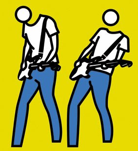
So here is some of the development of my logo design ... as seen on the design sheets on me previous blog, I started designing my logo as a 3D stick man, owever this changed after I researched more into Julien Opie, I love the style of his pieces and felt the same type of style would work well with the product I am producing. 


Sooo ... thats the direction its going at the minute, hope you like the design so far, still needs a lot of developing at the moment.  Any feedback would be greatly appreciated! 

Speaking from experience 2!

So ... the last couple of weeks our PPD sessions have been more specifically created to co-operate with the recent brief we have been set.  We were told to find 5 pieces of work/pieces of packaging or designs which may relate to our work or influence us.  So ... here are mine!


Sooo ... these are my 5 chosen pieces/products.  I selected these images because i feel they relate well to my product from a design perspective and the logo design.  The 'Plain Lazy' design is what i target producing if i am to make so some of logo of my own which will then be put on shirts or other items of clothing.  The 'Don't Panic' packing design is what i plan to also produce, both on scale, simplicity and again the logo.  The illustrations are by Julien Opie, relates once again to the style of my logo.  Finally, the first aid kit, i know ... random, however one of my possibly ideas at the minute is to produce a 'Survival kit' so the design and size of the first aid kit seems an appropriate image/product to use. 

Speaking from experience!

So ... a new brief and we have been told to produce a graphic response/graphic product/piece of work that will make a statement, comment, observation, instruction or will give advice about our experience about being little first years for the future children of the course.  

The Problem: Surviving on a student budget

What am I going to do about it: Give the new first years tips and tricks on how to save cash in a informative and humorous manner

How am i going to do it: Produce a graphic response which will be targeted specifically to graphic design students, this includes posters, leaflets, survival kits and possibly clothing.

Fin x 

Monday, 30 March 2009

Tell a convincing lie! No8

So ... this is it, the final resolutions set in the real world ... this project has been very enjoyable, hard work, but well worth it with great results!  Working with Charlotte has been great fun, a shared amount of responsibility and input made sure we always worked well together ... cheers Charlotte for a great stress free 2 weeks! 


So there we go ... the final resolutions in the real world ... looking good, simple resolutions but still very affective which answer the brief correctly! 

Mmm that was good fun ... love as always x 

Friday, 27 March 2009

Tell a convincing lie! No7

Nearly at the end of this brief now, and all we had left to do was produce 3 design boards (A2 scale) for friday for a crit.  Not a problem, so we decided to keep with the facebook theme and the limited color pallet and produced our 3 boards without a problem.  The boards had to address the areas (a board for each) these were: 
  • Board 1 - Concept and Brief 
  • Board 2 - Resolution
  • Board 3 - Context and Delivery
Well ... here they are ... enjoy!

So, as I said, we decided it would be good to keep to the facebook colors and try and work to their layout.  Once these were produced, we went for a final crit where we got very very good feedback which included:
  • Very Successful project, meets the brief and accomplished goals, good design for poster but very affective. 
  • The project was a success, we would invest in it as it spread the 'virus' well. 
  • Professional and clear presentation which was easy to understand, both team members seemed comfortable with their project and each other. 
  • Nice idea.
The only bit of negative feedback we received was off another team who said that our idea was 'Controversial' and 'Tacky' ... usually I would take criticism well and address the problems which the viewer/client had, however on this occasion because our project and resolution was far more successful, I think the other 'team' should take a closer look at our resolution and take notes ... because we kicked their ass!

Love as always! x 

Tell a convincing lie! No6

Time to tell the truth I think ... ok, class of '2011' ... Caroline Young does not ... I repeat DOES NOT exist ... its a computer generated personality sculpted by myself and Charlotte, thats rite people, we lied and convinced you ... we did the brief, now heres how we did it!

Our target ... to get into your life through the most popular social networking and h site ... FACEBOOK!!

First things first, lets give this girl a fake email address (which we also made) a fake name, address, date of birth ... the list goes on!

A lie in the making ... literally ... this screen shot shows me and Charlotte developing our new characted (Caroline) on facebook. 

Well ... it was so convincing that 'Caroline' got a few lads interested ... ouch!

Hmmmmmmmmm ... you were fooled people! Love always x 

Thursday, 26 March 2009

Tell a convincing lie! No5

Ok, so new logo, new poster ... we decided to carry on the theme with 'WE' ... so decided the poster of just me originally did not suite what we were doing and the lie we were (still are telling) so ... we re-designed the poster, and here it is ... enjoy!


This team work thing ... its good! Loves x 

Tell a convincing lie! No4

Ooook ... some a little bit more development WHICH I can inform you on!  Ok all is going well, me and Charlotte are still working very well as a team and not wanting to kill each other unlike others ... anywhoo ... we decided our logo wasn't rite, it was working, but it currently said 'WHO AM I' so we decided because of the nature of our lie, it should be changed to 'WHO ARE WE' ... awesome!  Anyway here is the new logo, not much has changed, just the color really ... enjoy!


Now ... thats teamwork!  Love youuuuuuu x 

Wednesday, 25 March 2009

Tell a convincing lie! No3

Just a little update on whats happening ... not giving to much away, after all we are trying to tell a convincing lie!  So me and Charlotte have generated a load of fresh ideas and this is the direction it is going it ... Posters 
  • Flyers 
  • Bus stop boards
  • Billboards (possibly)
So .. without giving to much away, our brands name was agreed to be called 'Who Am I" and below are two of the final logo's (1 of which is too be chosen) 


(No ... I don't know why the black in the second 'AM' came out grey ... technology hay?)
Rite so after we both developed and agreed on the final logo, we were free to carry on with our posters for our campaign ... now as I said previously, I can put this poster up, as its not actually an official which we will be using, and it doesn't give away our idea ... I don't think?


Its been a while ... dammit, this is love x